Starting with Clarity
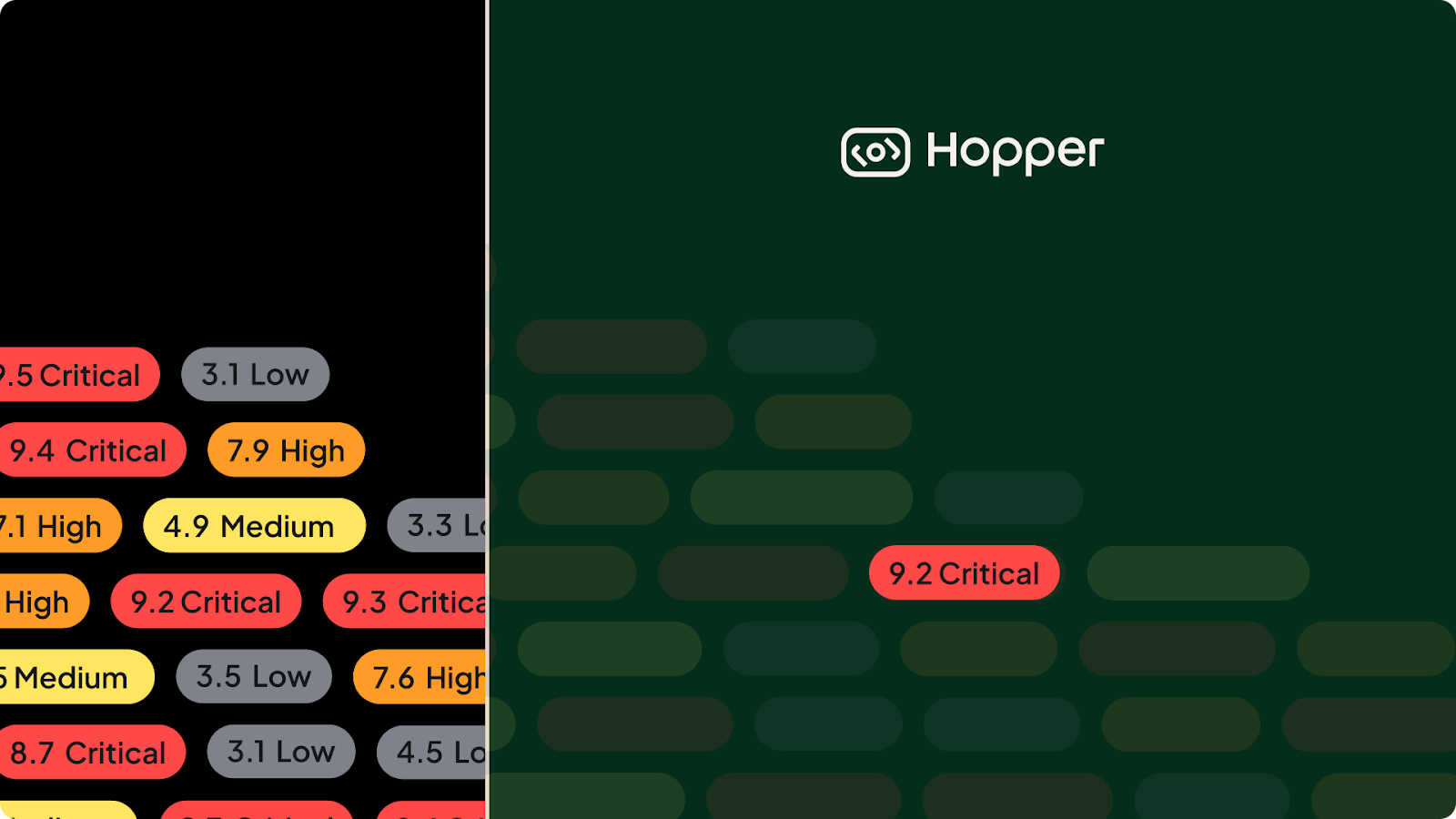
Two years ago, Hopper began with a clear mission: cut through vulnerability noise so teams can focus on what truly matters.
From day one, we have lived in a world overflowing with information — constant notifications, endless feeds, and now AI-driven data streams demanding even more of our attention. Focus has become one of the scarcest resources.
In open-source risk management, the noise is even louder: false positives, bloated vulnerability lists, and overwhelming dashboards. Real threats get buried, leaving teams chasing shadows instead of addressing the issues that truly put businesses at risk.
At Hopper, our goal has always been to reduce unnecessary work, giving teams the clarity to protect what matters and make an impact without slowing developers down. That principle has guided both our product and our brand from the very beginning.
The Challenge
Designing for cybersecurity isn’t about aesthetics. It’s about trust, clarity, and resilience. We faced a simple but tough question: how do you take something as complex and noisy as modern AppSec data and make it instantly understandable?
That question became our north star. Every element, from brand components to product interactions, had to remove friction and quiet the noise.
Building a Brand That Feels Clear
When we started our branding journey, clear became one of our core values. We wanted the very first impression of Hopper, before a single click in the product, to feel calm, focused, and intentional. So we stripped away clutter. Typography, icons, colors, and layouts were chosen to create an experience that felt precise, confident, and trustworthy.
The Logo
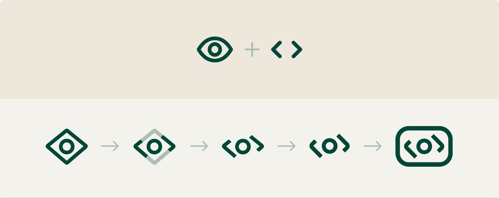
Our logo reflects this same philosophy. The eye symbolizes focus and awareness. The ability to scan millions of elements and zero in on what matters most. To make it distinct, we blended the eye with tag symbols, nodding to the way Hopper pinpoints risks with precision. The result is a logomark that conveys precision, intelligence, analysis, and protection, everything we want our users to feel.
Typography
When deciding on a typography, we chose a rounded, modern font that feels approachable yet professional. The goal was to make dense, technical content easier to scan without adding visual noise. Keywords in titles are highlighted with a clean rectangular background, like a spotlight, guiding readers’ eyes to what matters most. Typography, in this way, became another tool for clarity, turning information into something teams can absorb quickly and confidently.
Colors & Grace
In cybersecurity, design must balance stability with clarity. Too sterile, and it feels cold; too alarmist, and it creates panic. Our palette strikes the middle ground: aiding comprehension, adding energy, and maintaining professionalism.
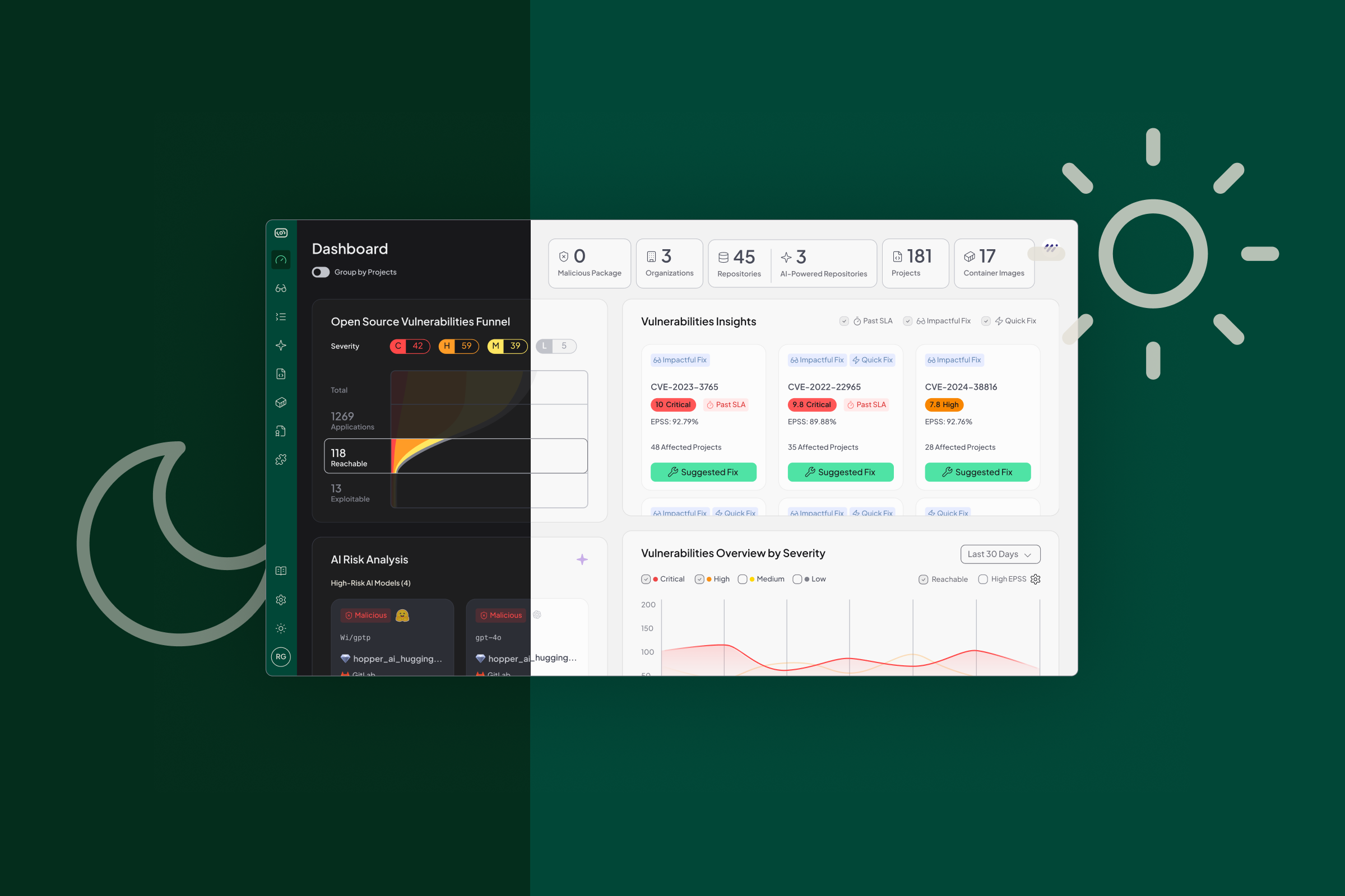
From the very beginning, we designed Hopper in dark mode, giving us a strong foundation for contrast and focus. Against that backdrop, our luminous green became Hopper’s signature cue for action. It marks every call-to-action (CTA) button in the product and across marketing, creating a universal signal that guides users seamlessly to their next step.
We recently introduced purple as our dedicated color for AI in the product and brand, so whenever users see it, they know they’re engaging with AI-driven insights. To make this even more tangible, we created Grace, our AI AppSec Engineer, named after Grace Hopper. Grace embodies clarity and innovation, guiding teams through complex security challenges with clear, actionable answers. Wherever Grace appears, purple is her voice — a clear, consistent cue that makes AI feel human, approachable, and unmistakably Hopper.

Designing a Product That Makes Complexity Simple
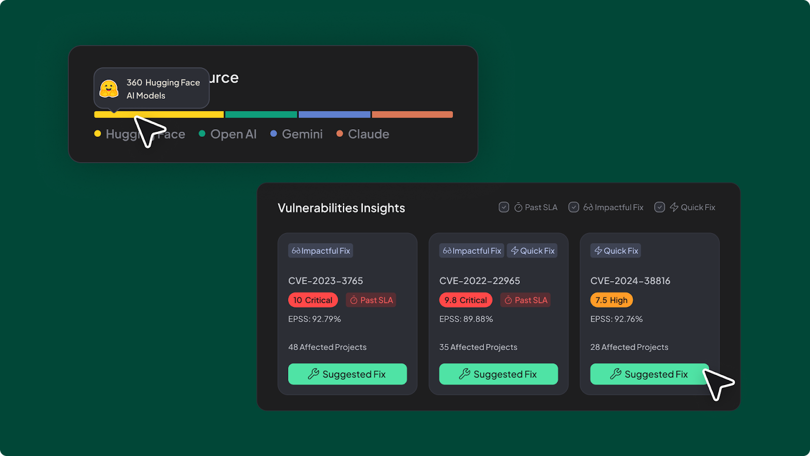
Just as our branding had to convey calm and focus at first glance, our product design had to deliver the same clarity once users stepped inside. Instead of overwhelming teams with crowded dashboards and endless alerts, Hopper surfaces the essentials first, with deeper details available through layers, hover states, or pop-ups. Microcopy is concise and precise, guiding without overwhelming.
Before a single line of code is written, we build fully interactive prototypes in Figma. Every button is linked, every flow is tested end-to-end, so the experience feels seamless from the start. The result is fewer distractions, faster workflows, and a product that makes complexity simple.
Not everything has to be serious. For our 404 page, we wanted a touch of playfulness. Instead of a blank error screen, users see a small dot stuck in a closed maze with the message ‘This page is unreachable’, a word that feels natural to our users and the world of cybersecurity.

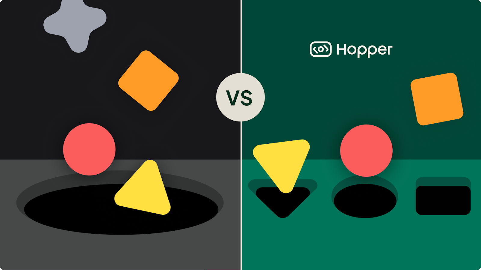
We also turned to the classic shape‑sorting toy as a playful metaphor: just as only the right piece fits the corresponding slot, Hopper’s function‑level reachability ensures that only truly reachable vulnerabilities are flagged, avoiding the false positives that trip up competitors using broader, less precise methods.
The Ongoing Challenge
Two years in, our design philosophy remains the same: clear over clutter, focus over noise. Branding and product design work hand-in-hand to make every Hopper experience sharp, intuitive, and calm, because when distractions fade, the real work comes into view.
The noise in our industry isn’t going away, it’s only growing. Software is moving faster, AI is adding new layers of complexity, and security data is multiplying every day. Our ongoing challenge is to keep cutting through it — to design simple, focused experiences that help teams see clearly in a noisy world. And that’s the challenge we’re excited to keep solving as we grow.


