
Let There Be Light Mode
For most of Hopper’s journey, the product lived in dark mode. It made sense. Developers, AppSec engineers, and security analysts spend long hours staring at screens. Dark mode was the easiest way to meet teams where they already were and keep the focus on what mattered most. But even the best tools deserve a little sunlight.
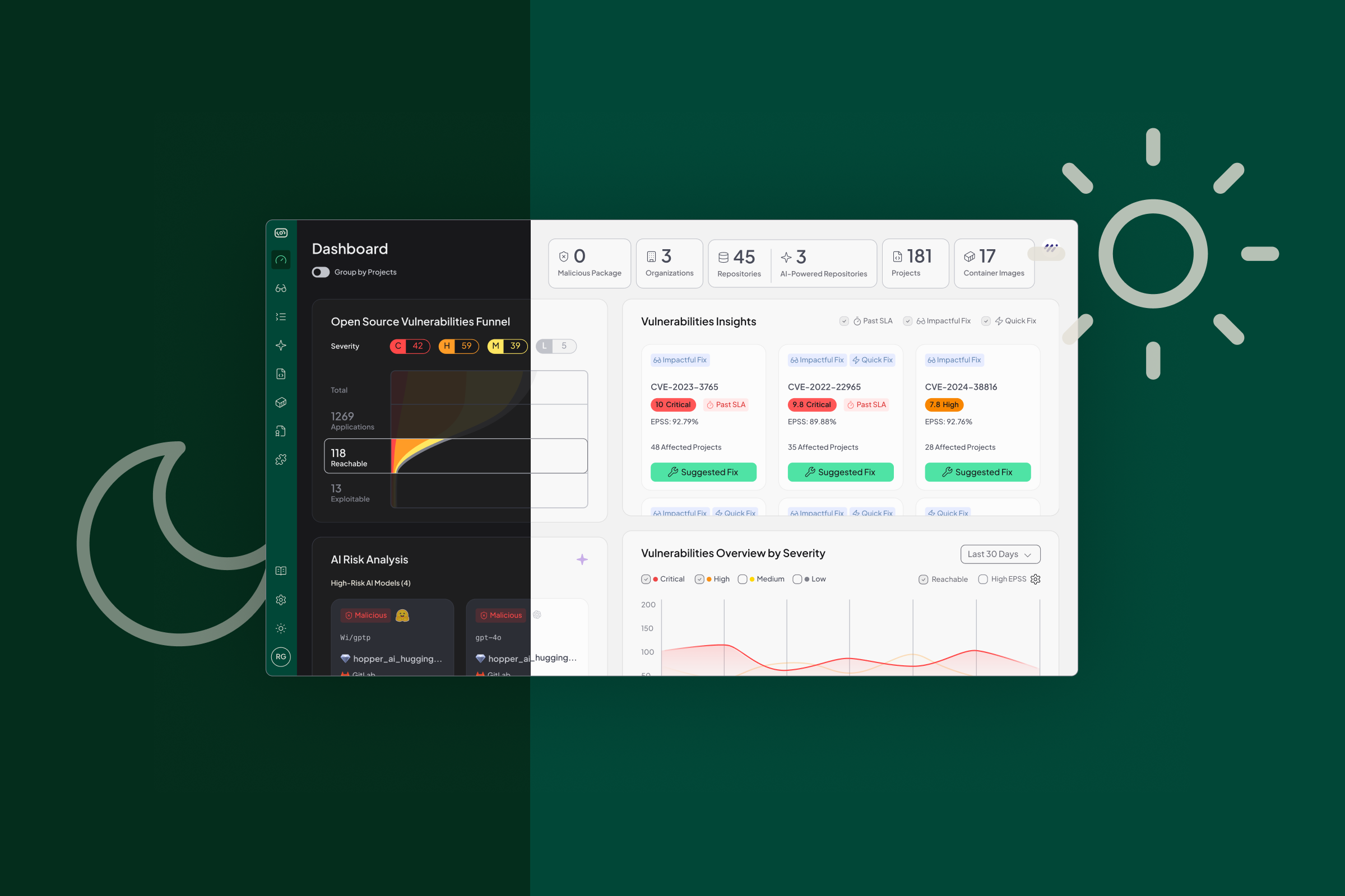
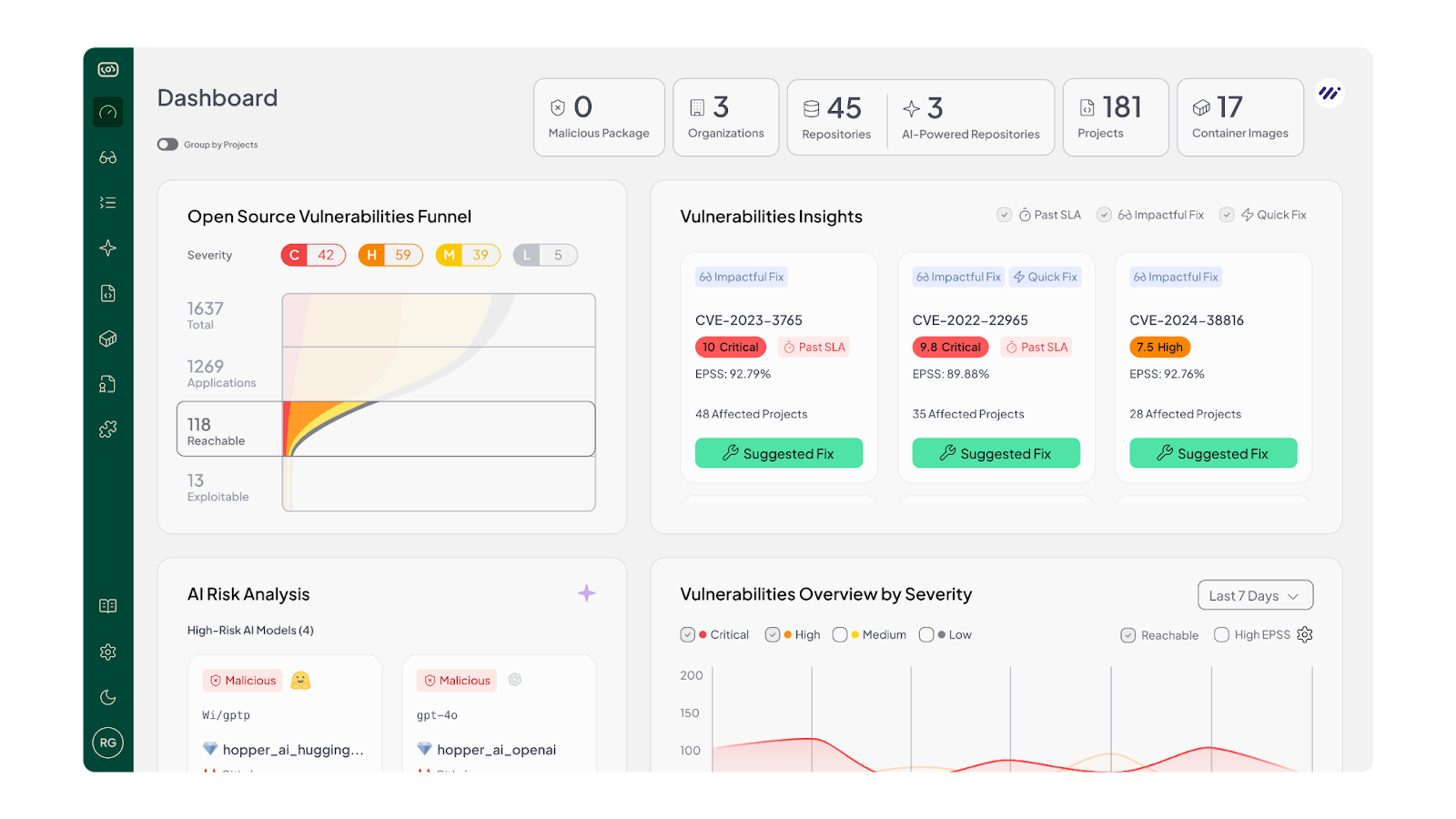
Light Mode offers a brighter, cleaner, and high-contrast option for those who prefer a lighter workspace. Same Hopper. Same function-level reachability. Same noise reduction and precise risk visibility. Just a fresh look that feels light, crisp, and easy on the eyes.
Why We Did It (And What It Took)
At the beginning of the project, we treated Light Mode as a “flip” of Dark Mode: we retained the same components and screen designs, and simply adjusted each token in our design system to a lighter equivalent. We thought: change the token value, and everything beneath will automatically fall into place.
Then we took the screens live, and the result was… far from what we hoped.
- Screens looked too bright, lacking balance.
- Some elements, in a sea of whiteness, lost their visual hierarchy or looked washed out.
- Text became harder to read in certain instances because the contrast wasn’t tight enough.
- Other elements had too much contrast-sharp, jarring, uncomfortable.
- Overall, it wasn’t a pleasant view. It felt like dark mode in reverse, rather than a thoughtful light mode.
That’s when we realized: smart design systems don’t just invert colors; they redefine them for the light context.
We needed to go back and define specific colors for the main and basic components, not just generic “turn dark tokens into light tokens”, but “this button in light mode uses this specific color, this background uses that, this text uses this, this sub-text uses this”. Some of the new and basic components still needed their own defined color, and in many cases, we realized we didn’t need to adjust everything: some tokens simply worked as-is.
In short, Light Mode isn’t a “dark mode with white swapped for black”. It’s a first-class design mode with its own set of color decisions.

Choose Your Vibe
Light Mode is built for comfort. Some people work better with bright backgrounds. Some find it easier to scan long lists of dependencies and vulnerabilities with a clear, high-contrast layout. Others just want a little more personality in their workflow.
Now you can switch between Light and Dark instantly, depending on mood or setup.
This update keeps teams aligned: security, engineering, compliance, and platform. Each can choose the interface that works for them, without changing how they collaborate.
Light Mode works across the entire Hopper platform: from asset-discovery to our AI AppSec tools to detailed remediation guidance.
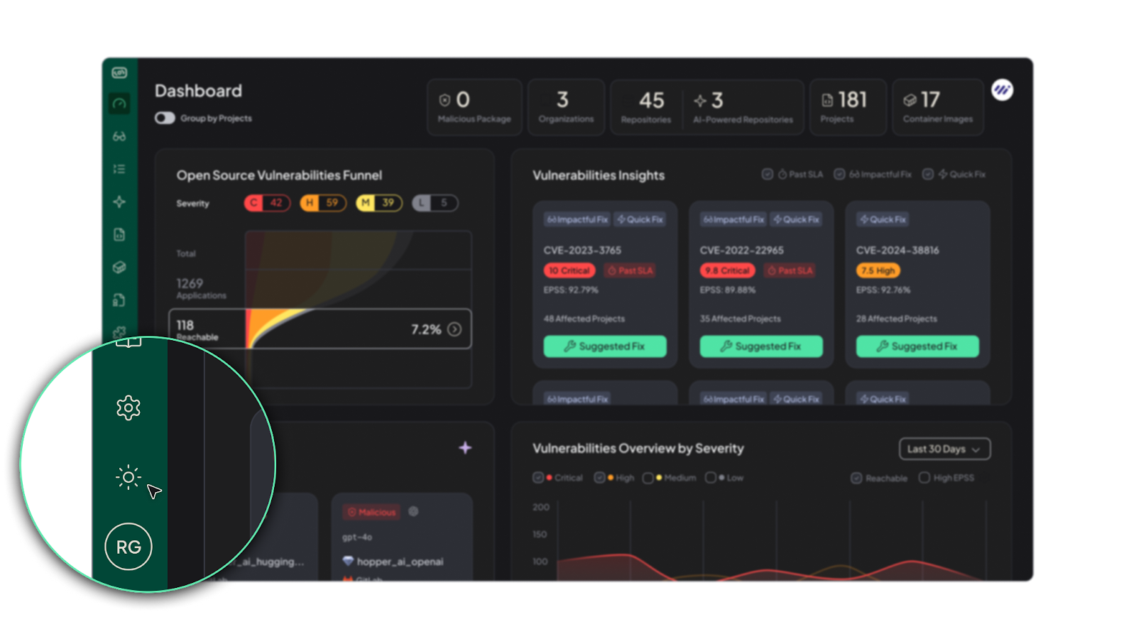
To try it: simply open your Hopper workspace, view the left-hand navigation bar, and select the sun icon for Light Mode. Go ahead. Let a little light in.
And if Light Mode isn’t for you, toggle back to the moon icon for Dark Mode.
A Few Insights & Tips for Using Light Mode
1. Ambient Light Matters:
In bright working environments (daytime, open office, large windows), Light Mode often enhances readability. Dark mode tends to shine in low-light or late-night settings. By giving users both, we’re meeting real context variance.
2. Accessibility is Not One-And-Done:
When we switched modes, we revisited contrast ratios, tested text legibility, checked for color-blind friendliness, and made sure icons and states still popped. Light Mode forced us to go back to the fundamentals of readable, accessible design, which ultimately benefits everyone.
3. Component-By-Component, Not Token-By-Token:
We learned that while design tokens are a powerful tool, modes require thoughtful overrides. Buttons, cards, tables, highlights: each needed review and sometimes dedicated colors. Which is why the rollout took months.
4. Real World User Behavior Varies:
Some folks work on laptops with bright screens, some on external monitors. Some code in terminals, some only review dashboards. That diversity means one theme won’t magically serve all use-cases; flexibility matters.
5. User Psychology And Habit:
It’s interesting to note: many users naturally gravitate toward dark mode. Recent surveys show that 82.7% of desktop and laptop users use dark mode on their operating system, and 78% say they enable it for accessibility reasons, such as reduced eye strain and improved focus. But the flip side is just as important: in bright, well-lit environments, light mode often supports faster reading and better comprehension, which is why offering both modes gives users the flexibility to work in whatever conditions suit them best.
Why This Matters for Hopper Users
- As a security platform, Hopper is used for intensive, detail-driven tasks. Long sessions, high focus, complex data. Giving users a choice means giving them comfort and performance.
- We believe that how you see the data affects how you act on it. A layout that's easier to scan → faster triage → quicker responses.
- By building Light Mode thoughtfully, we also improved our design system at large: better contrast, more clarity, and more consistency.
- For teams working across roles (engineering, compliance, platform), interface fatigue is real. Allowing theme choice helps reduce that friction.
Final Thoughts
If you’ve stuck with Dark Mode this far, we get it. It’s what we built our foundation on, and it’s what many of you prefer. But now, we’re proud to offer a full Light Mode that’s been engineered, iterated, and tested, not just slapped on top.
Switch it on. Explore the feel. See how it works with your lighting, your tasks, your rhythm. And if it doesn’t fit: flip back the moon. Either way, the experience remains the same deep under the hood; what changes is the vibe.
Let light in. Because even in security, sometimes stepping out of the shadow gives you the clearest view.

Liz is Head of Design at Hopper, with 15 years of experience shaping products and brands. She has worked with dozens of startups, helping them bring clarity and story through design. Outside of work, Liz enjoys practicing Vinyasa yoga, escaping into green nature with her family, and making the best pasta rosé.


